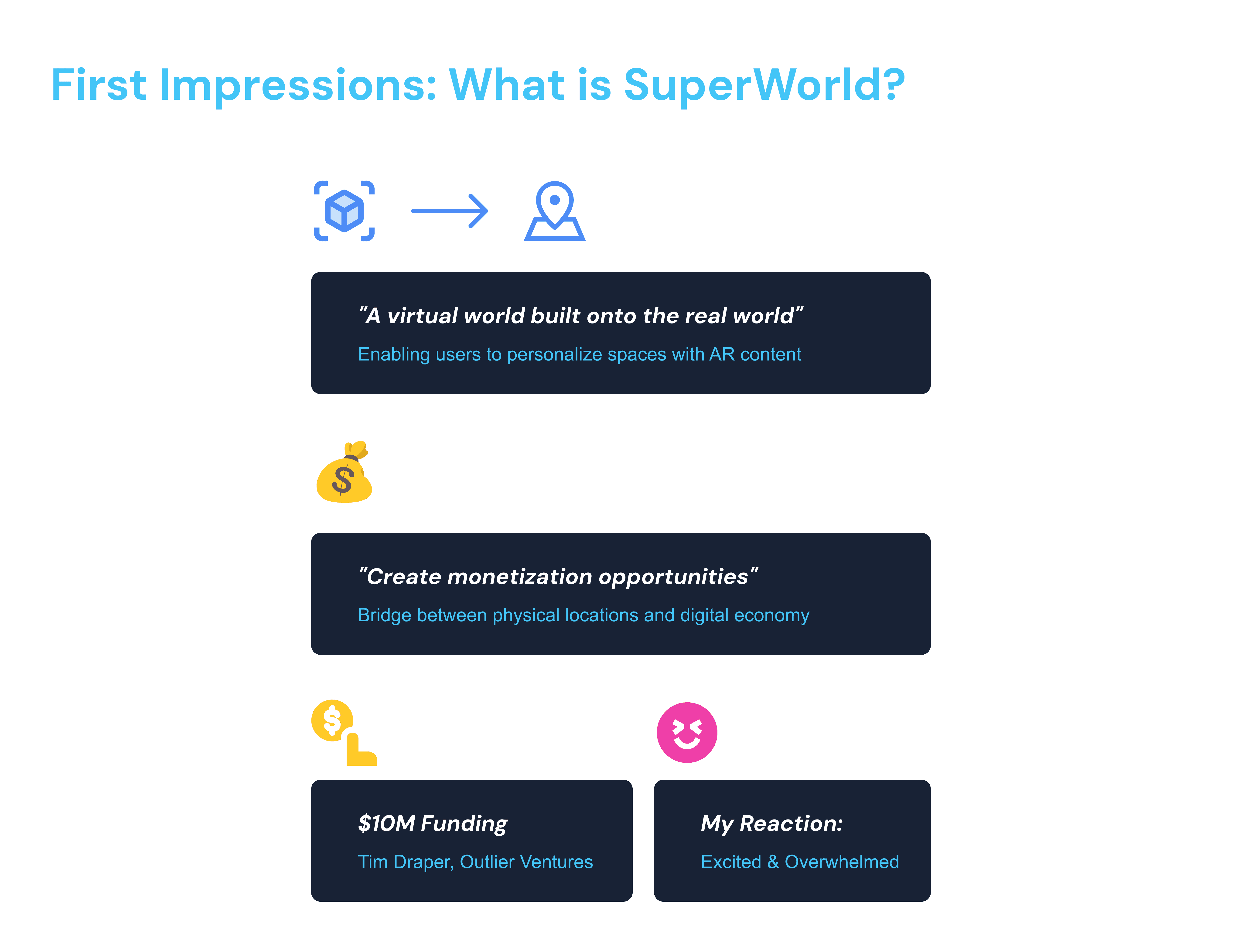
Buy, personalize, and monetize virtual land mapped to real-world locations.
About
Timeline
01/03/2025-04/02/2025
My Role
UX Designer, UX Researcher,
My Team
3 UX Designers
5 Dev team
CEO, PM
Deliverables
Architected a dual-view property interface that accelerated virtual land acquisition by 36%, enabling SuperWorld to scale from 21.5K to 35K plot transactions within three months of implementation.
Designed a streamlined notification system that increased user engagement with monetizable actions by 42%, directly supporting SuperWorld's mission to unlock real-world location-based revenue opportunities.
Developed a comprehensive Web2-to-Web3 onboarding experience that reduced new user drop-off by 58%, enabling non-crypto native users to successfully purchase and monetize virtual real estate tied to physical locations.rectly inform and evolve key interface decisions.
Impact
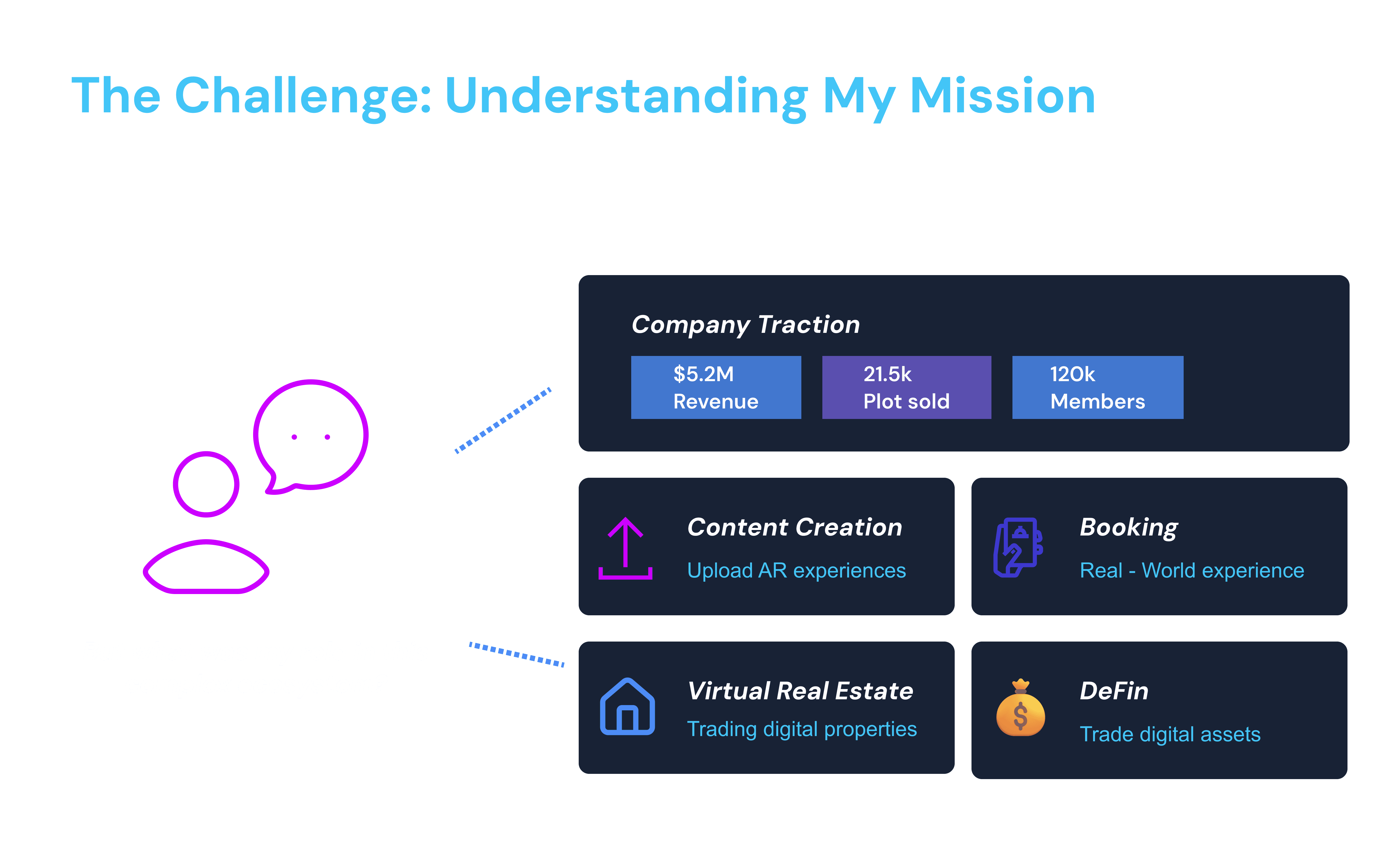
$5.2M
Revenue secured
42%
Increased user engagement with monetizable actions by 42%
80%
Increased user feedback by 83% through improving notification system
Prototype Overview
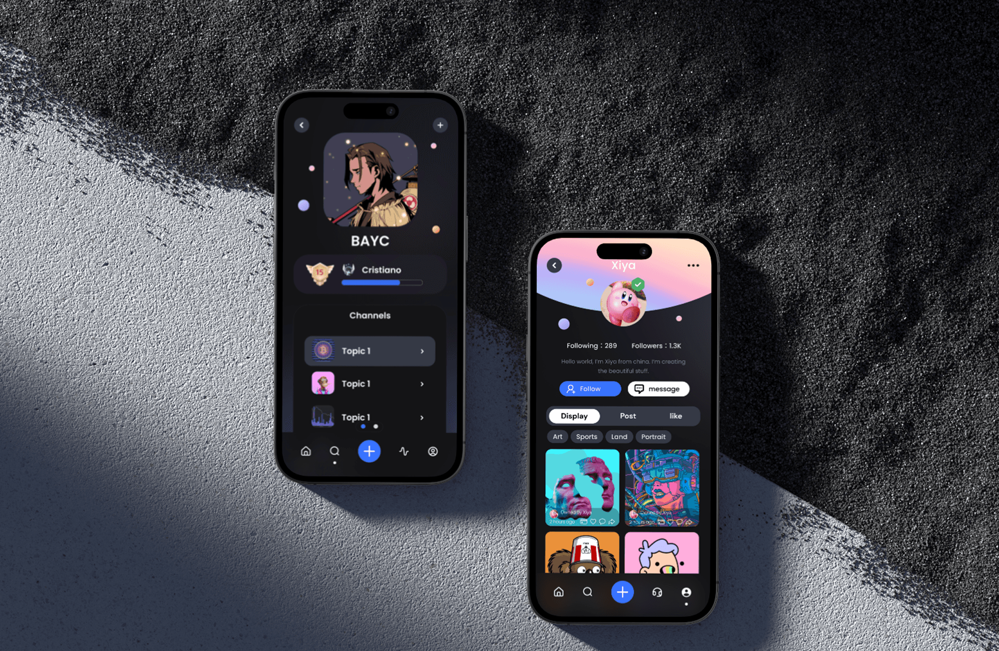
Check your properties
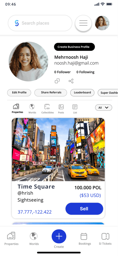
Users can monetize their virtual properties by regularly checking their portfolio through the "Check your properties" feature, which provides essential market information such as current valuations, recent offers, and potential revenue opportunities, allowing owners to make strategic decisions about when to sell, trade, or leverage their digital assets for maximum financial return.
Save interested places in profile
The "Save Interested Places" feature allows users to like and bookmark locations by clicking on existing icons on the map, with options to add these places to their travel plans. This creates a personalized collection viewable in their profile, potentially enabling future purchases of these locations or related tickets, further enhancing the product's financial dimension and creating new monetization pathways.
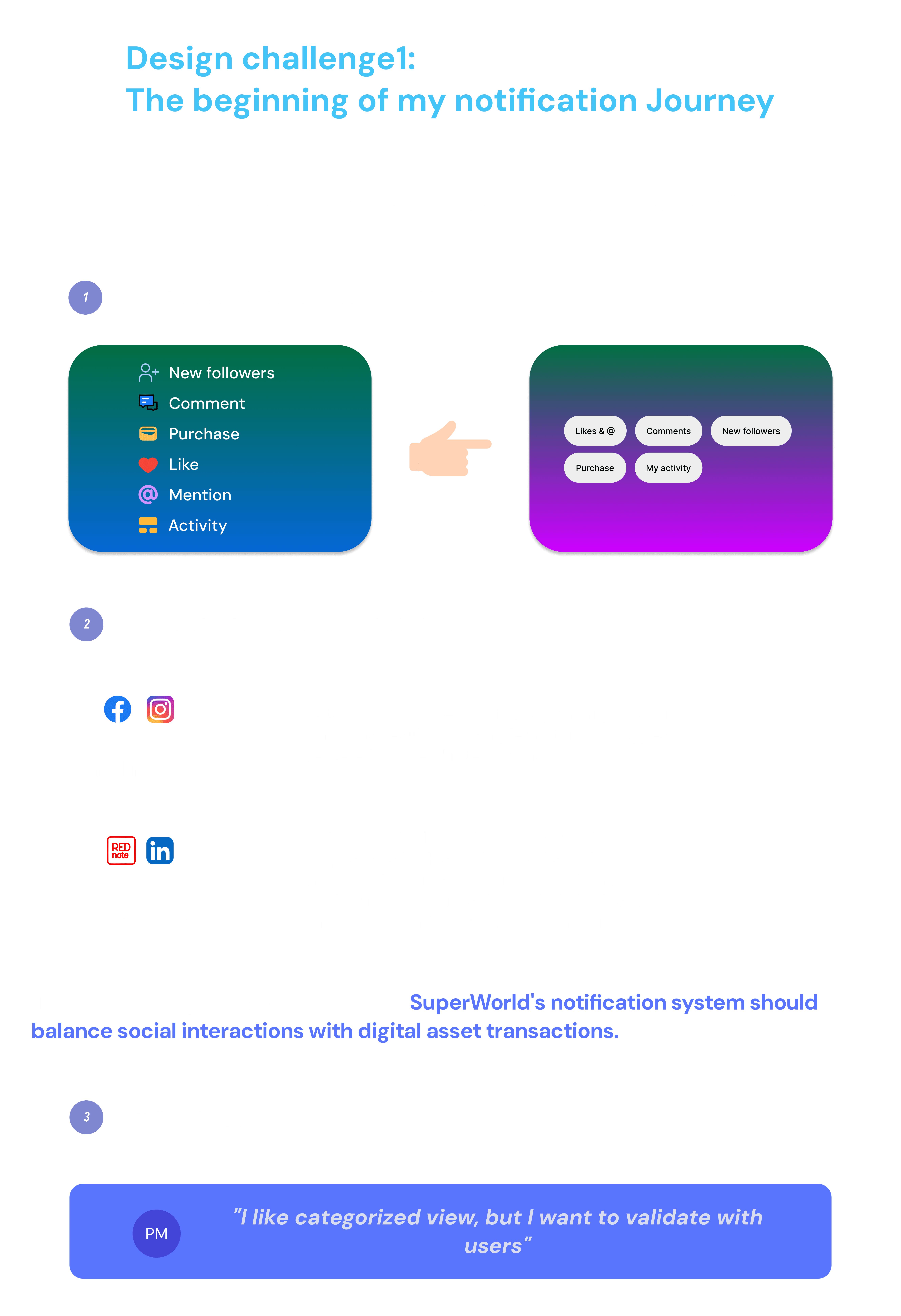
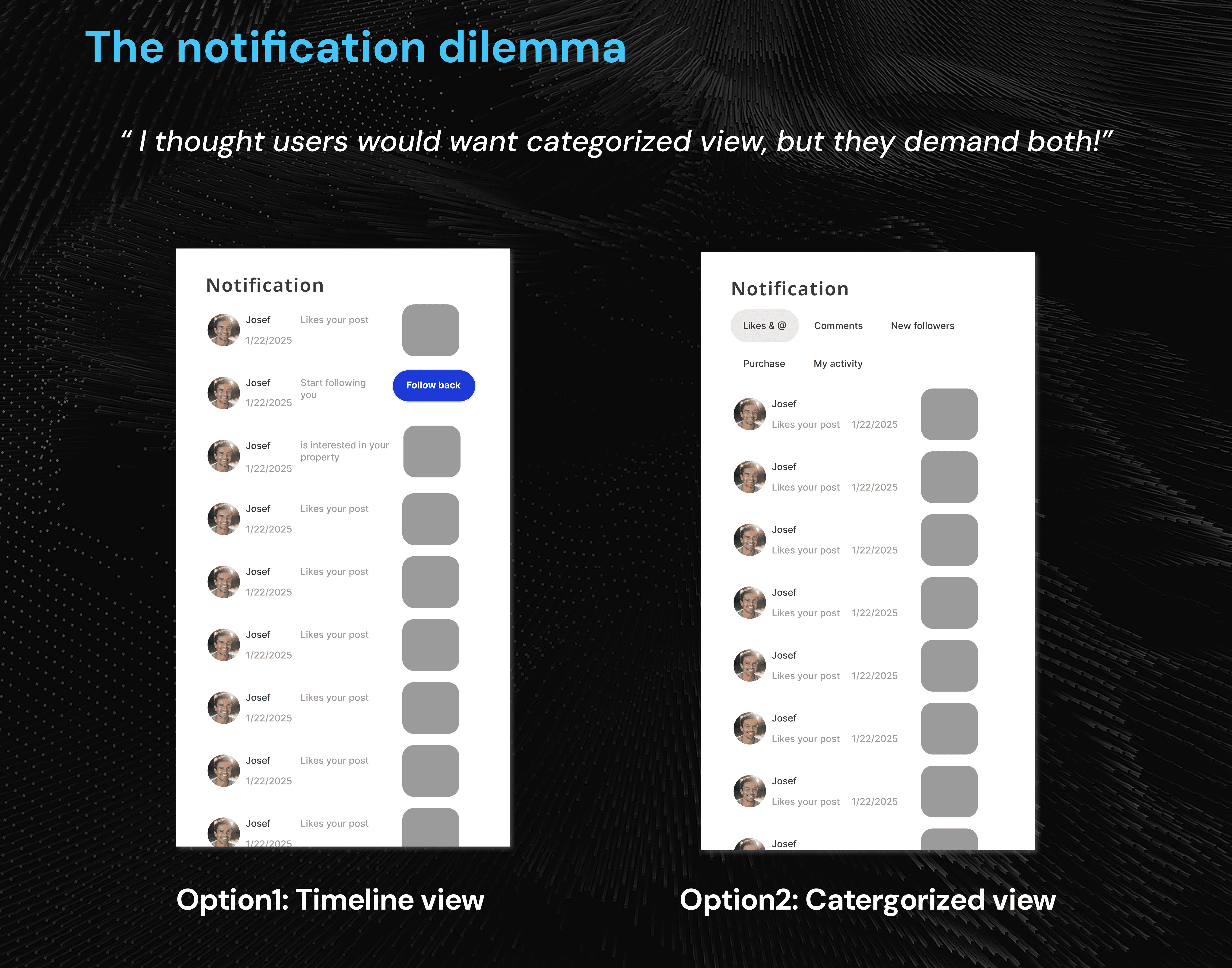
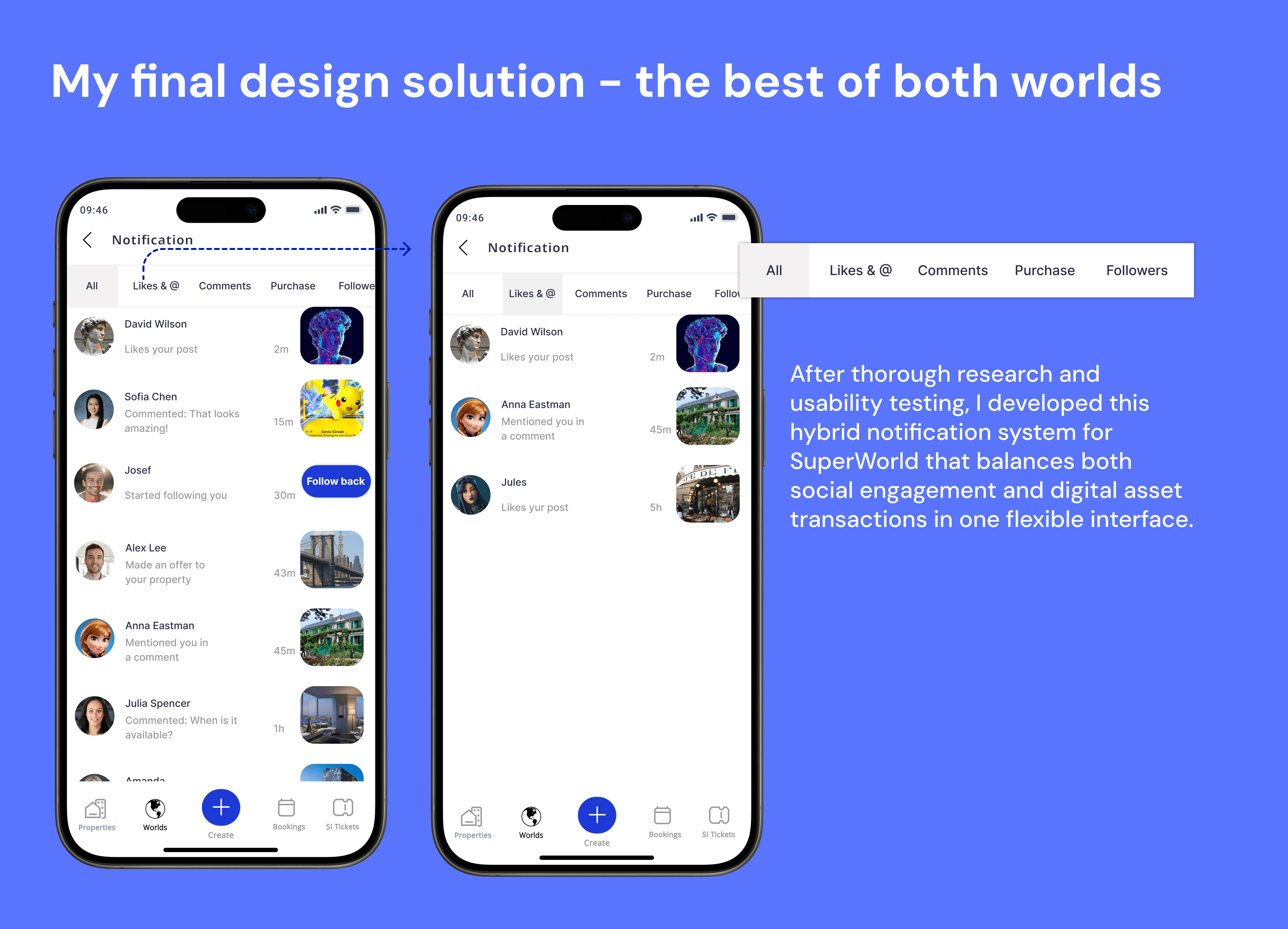
See the notification
Users can maximize their property monetization potential by monitoring notifications for purchase offers and market changes, while also tracking social engagement like likes, mentions, and new followers—all valuable metrics that help identify the best times to buy, sell, or promote their virtual real estate investments.
What you can expect

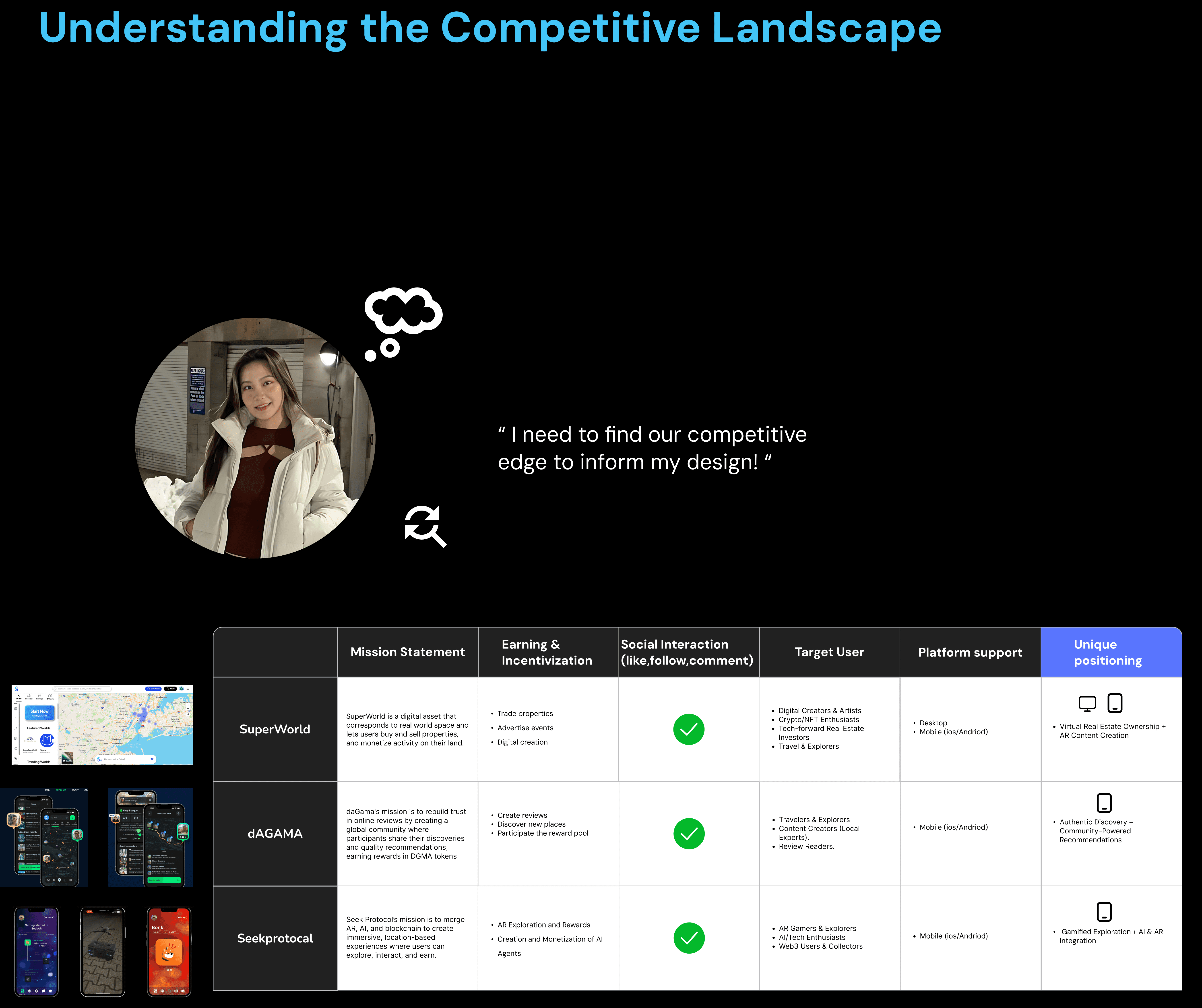
1. Integrated Property & Notification System
Streamlined interface with dual viewing modes and smart notifications, enabling seamless property browsing and timely alerts. User-tested for a balanced, cohesive experience.
2. Web2-to-Web3 Transition Strategy
Strategic onboarding using familiar UI to simplify blockchain, reduce drop-off, and boost virtual land adoption—advancing SuperWorld’s reach beyond crypto-natives.
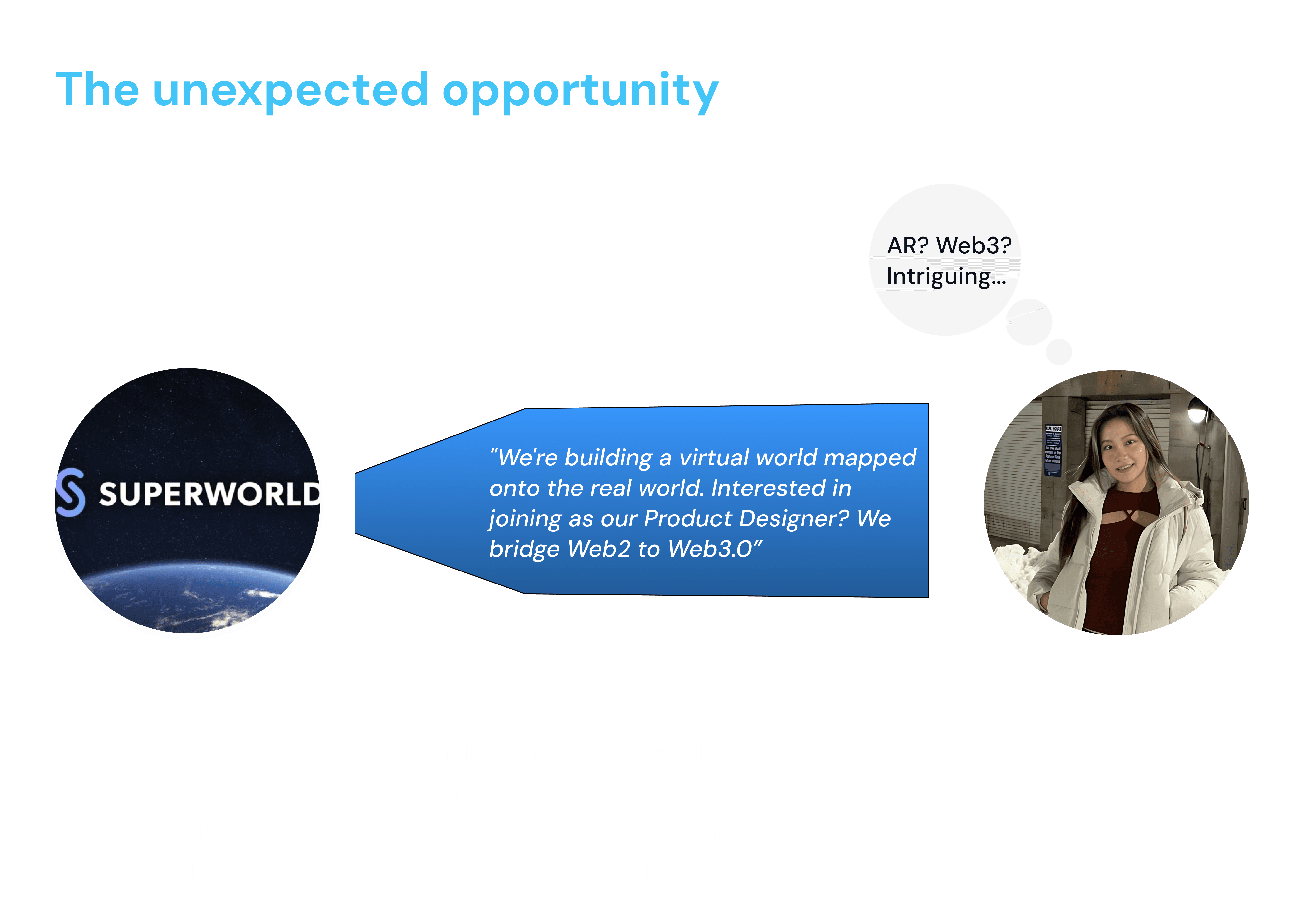
Chapter 1.
Stepping into the Unknown - My Journey with Superworld
Design challenge2:
Property Page: The Plot Twist in User Preferences
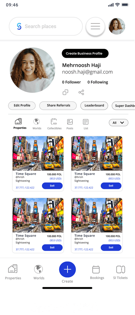
Original(1*1)
Problem Identification
When I began improving our property page design for mobile users, I noticed a fundamental issue: the previous designer had simply copied the desktop-sized property cards to mobile. This direct transfer meant each card took up an entire mobile screen, forcing users to excessively scroll when viewing multiple properties.
“How does the desktop version work for users with 10+ properties? Have we tested this with power users?”
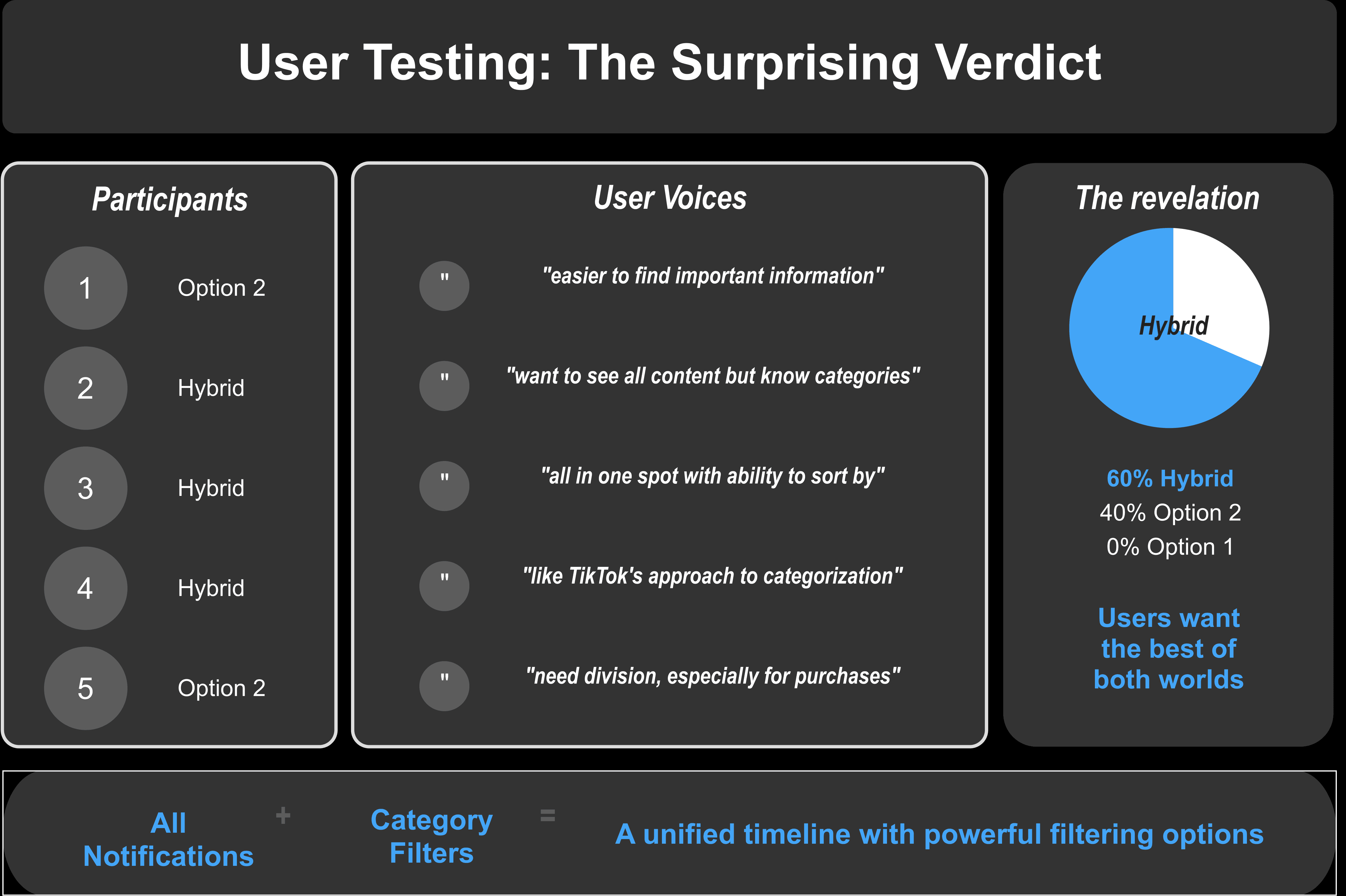
I decided to validate with real users instead of assumptions by conducting usability test.
I made a usability test with 5 participants, designed qualitative and quantitative questions and tests, comparing these two layout options.
Feedback insights
However
What surprised me most was that users didn't simply choose one "best" option - they wanted contextual flexibility between different views.
Chapter 3.
Reflection
Design insights from SuperWorld
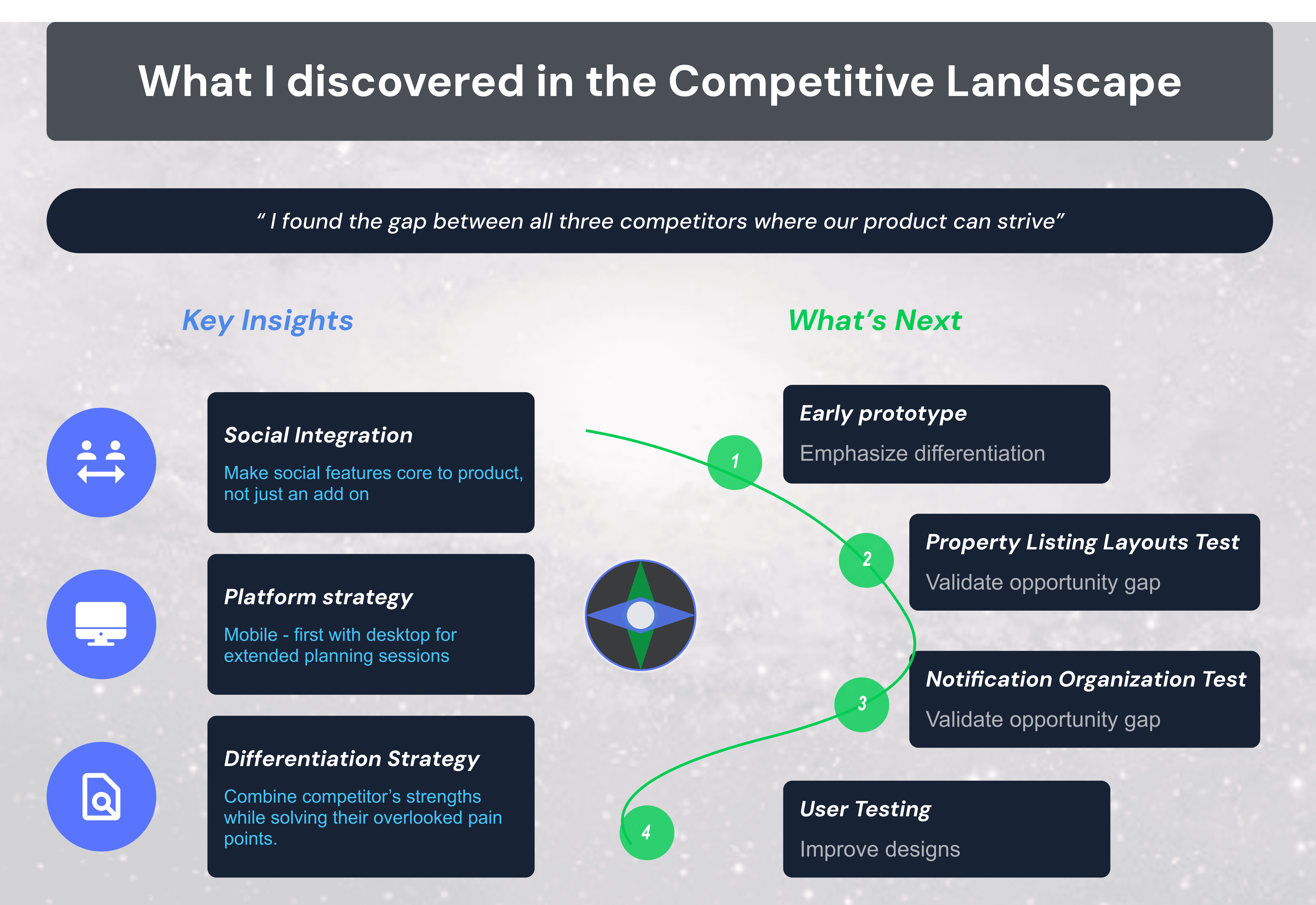
Challenging assumptions yields better results
I questioned the desktop-to-mobile direct transfer approach when redesigning property cards. By challenging this established pattern, I discovered a significant usability gap that would have hindered users with multiple properties.
User testing reveals unexpected insights
Despite my initial hypothesis that one layout would emerge as clearly superior, usability testing revealed that users wanted contextual flexibility between viewing modes. This unexpected finding led to a more adaptable solution that serves multiple use cases.
Balancing density with usability is critical
In the fast-paced mobile design world, finding the perfect balance between information density and usability is crucial. Strategic decisions about card sizing (2×2 grid vs. 3×3) significantly impacted user experience, demonstrating how small design choices can have