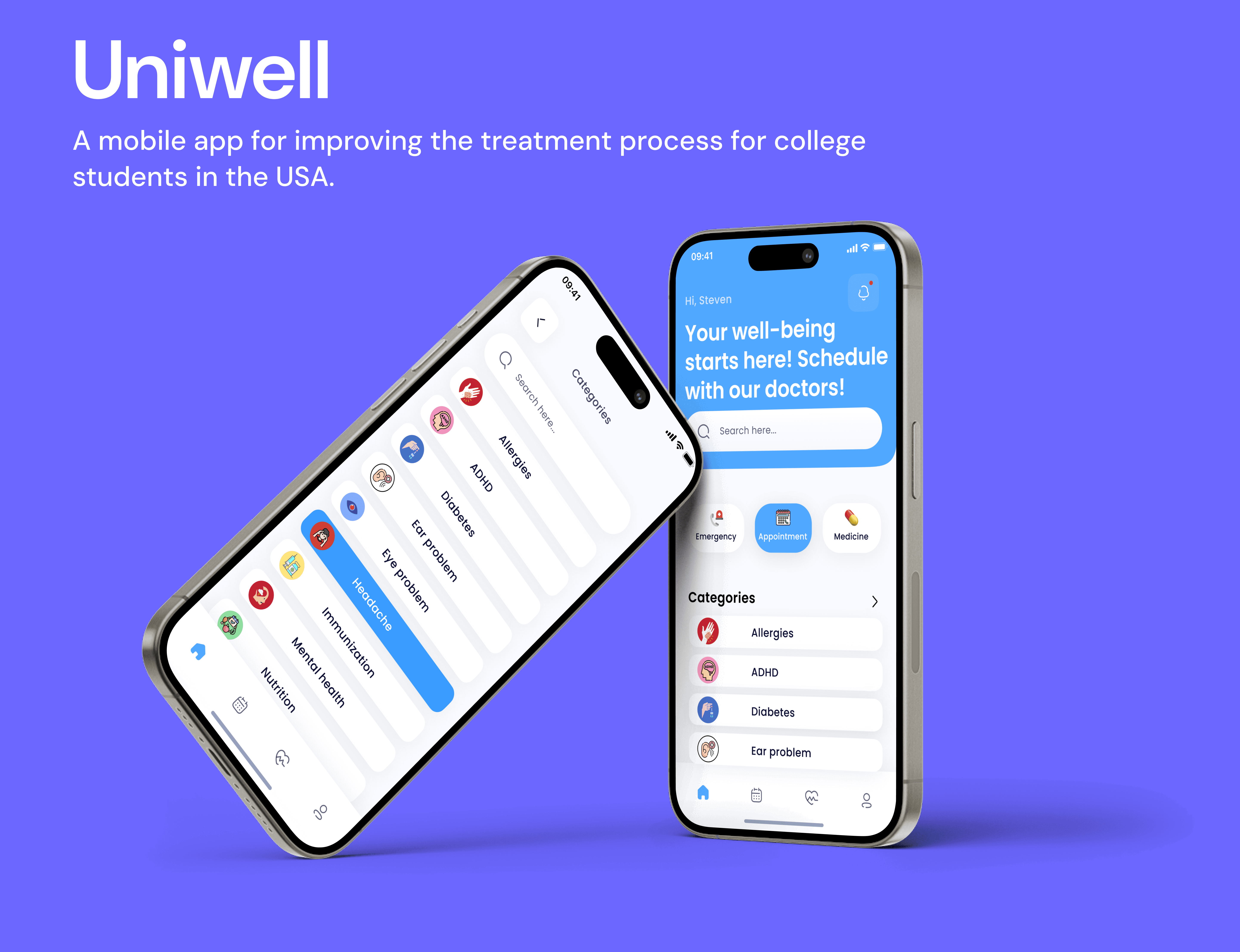
About
Timeline
01/15/2024-05/13/2024
My Role
UX Designer, UX Researcher, Group Leader
My Team
2 UX Designers, 2 UX Researchers,
1 Stakeholder
Deliverables
Present insights from user research and needs analysis, including personas and pain points, to demonstrate a user-centered approach in designing Uniwell.
Showcase Uniwell’s main user flow and usability testing plan for scheduling preferences, emphasizing validation of design decisions through user testing.
Highlight high-fidelity prototypes and visual designs of key screens to demonstrate Uniwell’s intuitive interface and user-friendly experience.
Prototype Overview
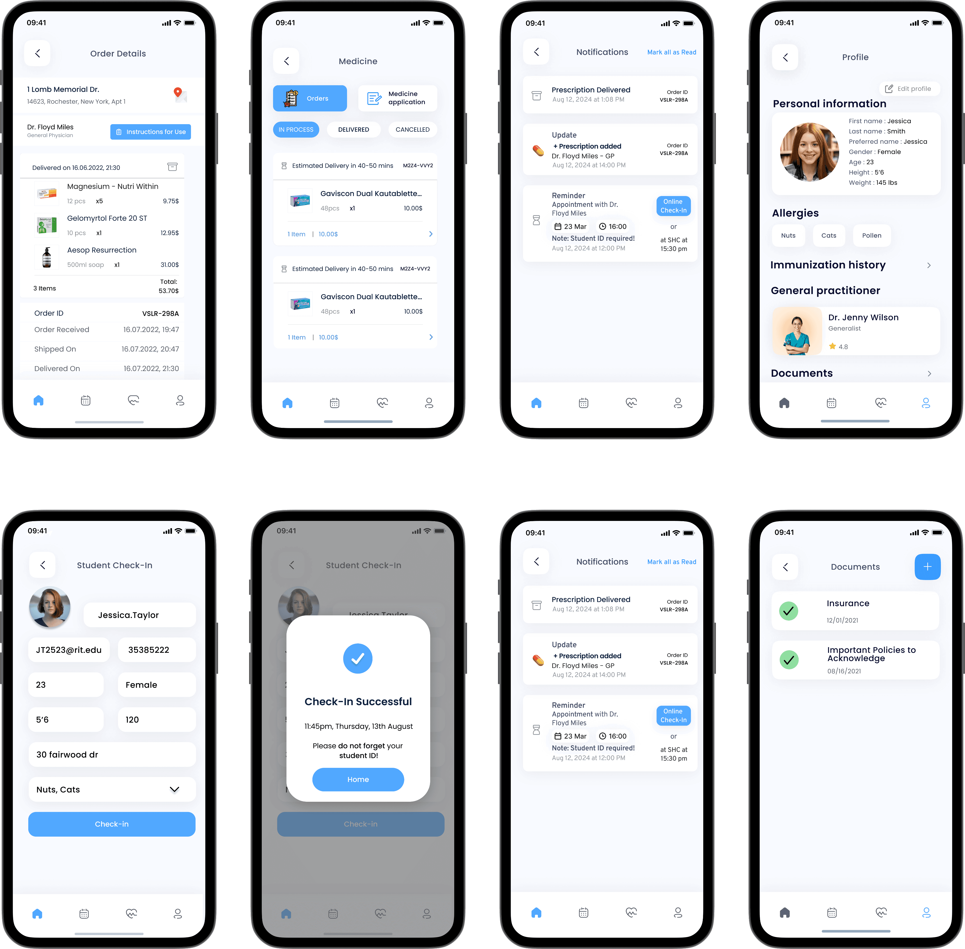
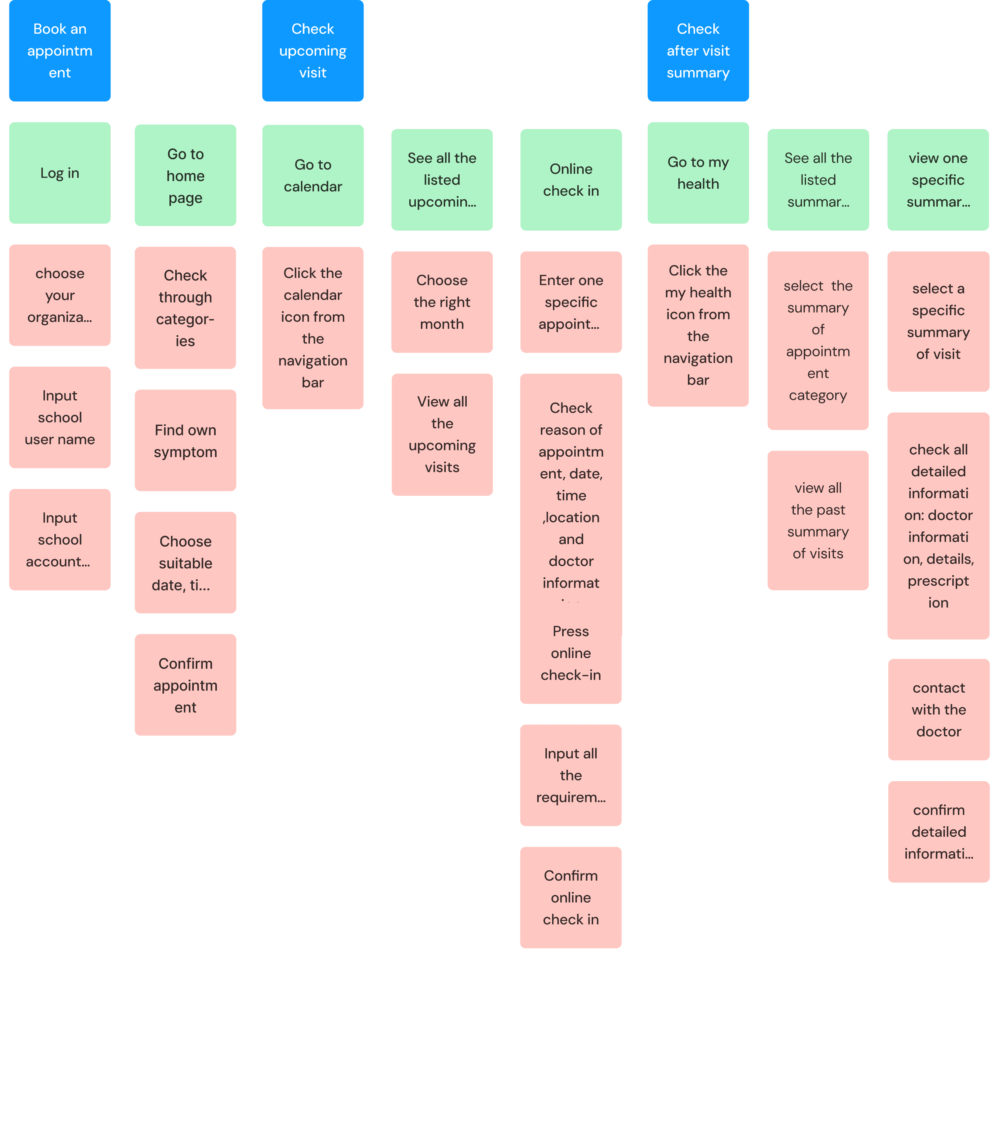
Book appointments
The user begins by logging into Uniwell, selecting their school, and entering their school email and password. Once logged in, they identify the reason for their appointment by selecting symptoms. Next, they choose a suitable day, time, and doctor to finalize their booking.
Check upcoming visits
By selecting the calendar icon in the navigation, users can view all their upcoming visits for each month. To check an appointment on a specific day, they can navigate to the desired date on the calendar and access detailed information, including the appointment's date, time, location, and doctor.
By clicking the health icon in the navigation, users can view a summary of their visits and recent appointments. Within a specific visit summary, users can access detailed information, such as the doctor's name, visit details, and prescriptions. If needed, they can also contact the doctor by sending a message through the chat portal.
Impact
83%
Increased user feedback
67%
Decrease in scheduling appointment time
83%
Increased user feedback by 83% through improving booking appointment flow
Stakeholder
Feedback
“ Uniwell really makes it easier for students to book appointments and find the right services.”

Student health center staff
Anna
Reflection
“ One of the biggest takeaways from creating Uniwell was learning how to balance user needs with operational requirements. Working with feedback from the student health center, I saw firsthand how design decisions could impact efficiency and workflow, not just the user experience. ”
“ Developing Uniwell taught me the importance of empathy and understanding user needs on a deeper level. Through this project, I learned how to design a solution that isn’t just functional but also inclusive, ensuring that all students can navigate healthcare with ease. ”
What you can expect
A deep dive into 3 of my most memorable challenges I faced. While this story doesn't encompass everything I did on the project, it highlights a particularly impactful problem-solving journey. If you're curious about other aspects of the project, I'd be happy to chat more!
Specifically, you will see How My Personal Challenge Sparked a Healthcare Revolution, How I Craft Success from Ambiguity.
Chapter 1.
From Individual Pain to System Insight: How My Personal Challenge Sparked a Healthcare Revolution
Have you ever had a moment when a personal crisis unexpectedly revealed a much bigger opportunity? That's exactly what happened when my left eye suddenly stopped working one November morning
When a personal crisis reveals a national challenge
Personal Emergency
Systemic Discovery
Nationwide Challenge
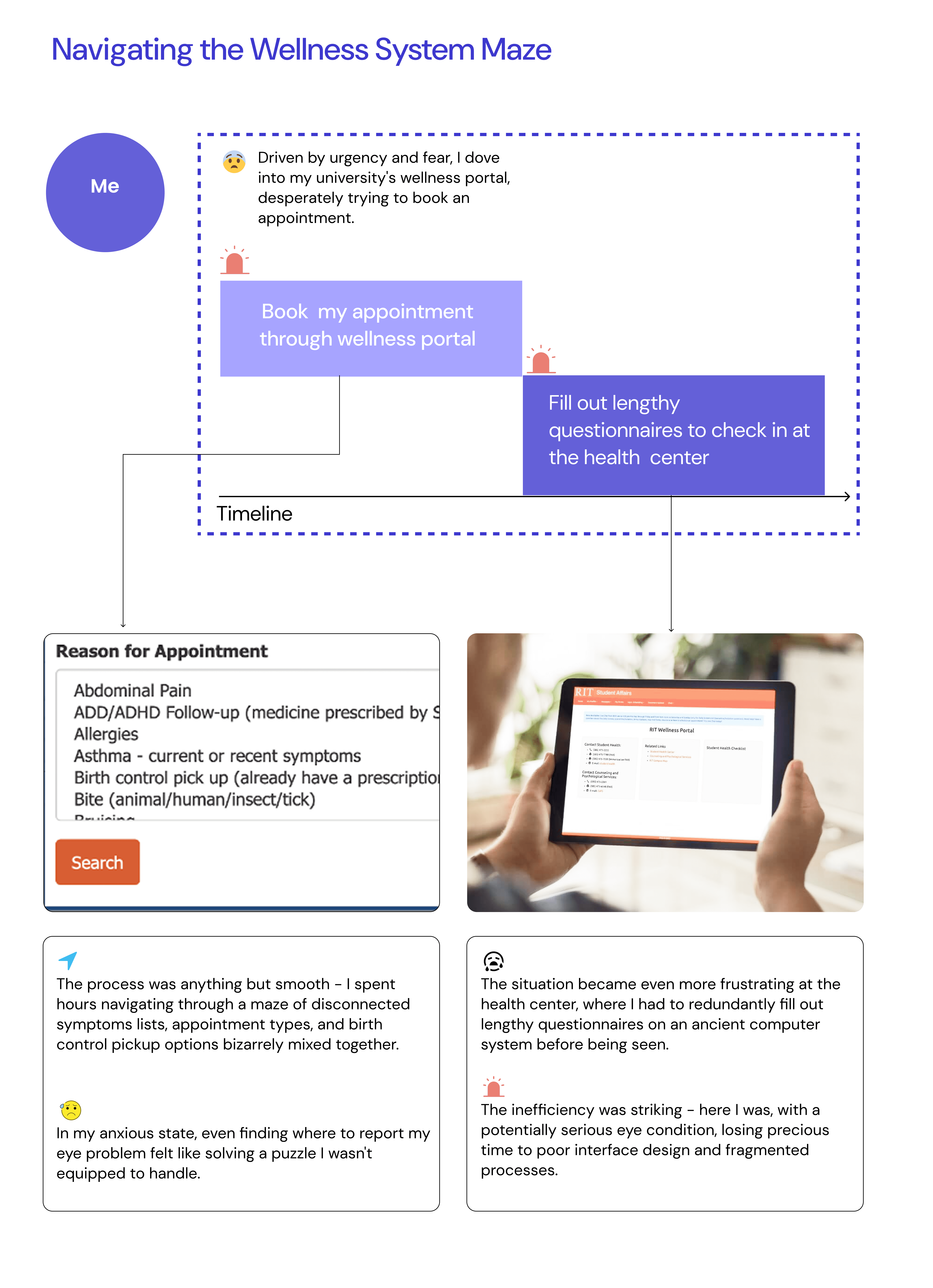
As a student navigating the complexities of university healthcare, I found myself thrust into a situation that would reveal systematic problems within campus wellness systems.
What started as a frightening personal medical emergency would eventually lead me to discover a widespread need affecting universities across America.
However
What started as a simple personal experience turned into a revelation about Product Market Fit.
As I began investigating other universities' wellness portals, I uncovered a pattern that stunned me.
Personal Experience
Inspiration
Product Market Fit
How I get there ?

Here are the three crucial steps I took to validate the market opportunity: I think the key here is systematic research and validation. Because when you follow the right process, you can transform a personal insight into validated market needs.
Step1. Looking at Different University Wellness Portals
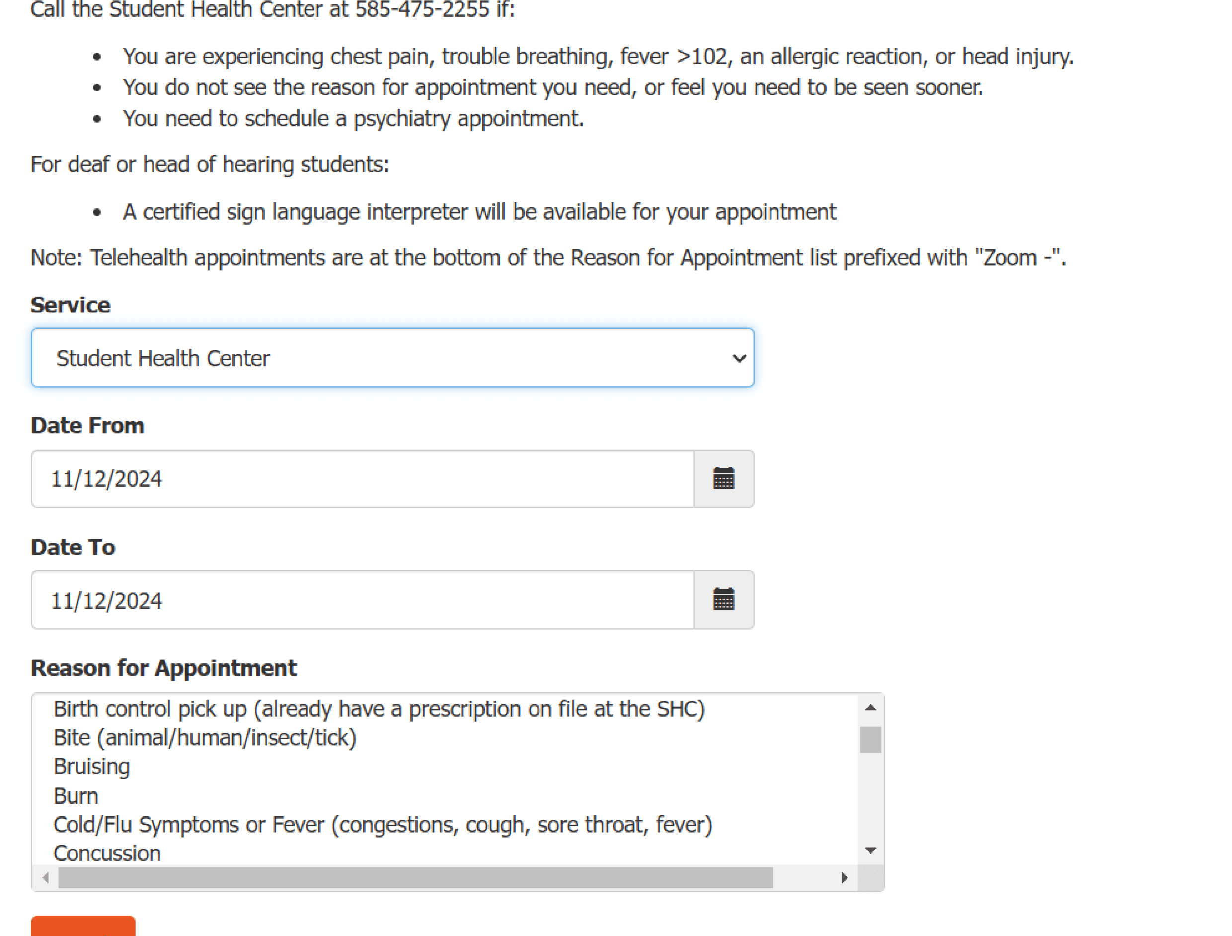
RIT wellness portal
Each new discovery made my heart beat faster. I sat at my desk, clicking through another university's portal, taking notes on every feature and how students use it.
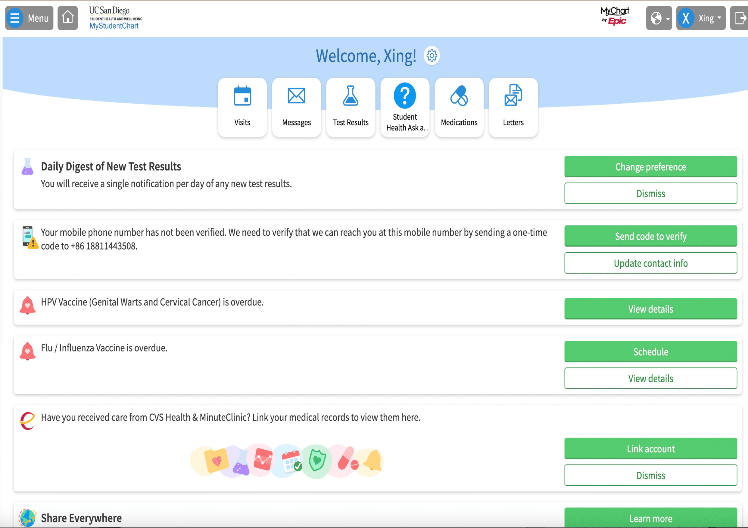
UC San Diego wellness portal
As my notes accumulated, a pattern emerged. Each university was wrestling with the same challenges.
The shocking statistic
90% had the same problems, and every school was trying to fix them on their own.
90%
Shared problems
"What if," I thought, "instead of each school solving this alone, we could create one solution that works for everyone?"
Step2. Talking to Students and Staff
I was sitting with my notebook, carefully writing down every story and complaint people shared. After the tenth person described the same frustration, I knew we were onto something big.


"How many students across the country are facing these exact same problems?" I wondered, seeing the bigger picture forming.
In-depth Interviews
After talking to
6 students
Finding
1 health center staff
85% were unhappy with their current systems and wanted something better.”
Step3.Looking at the Money Side

My eyes widened as I added up the numbers. I pulled out my calculator, working through each university's spending on their healthcare systems. The waste was shocking - millions spent on duplicate systems.
"What if we could help schools save money while giving students better care?" The potential seemed huge.
$500000
Each university spends about $500,000 every year on their system.
$70%
Our shared platform could cut those costs by 70% and work better for students.
Chapter 2.
From Fog to Focus:How I Craft Success from Ambiguity

The feedback we got.......
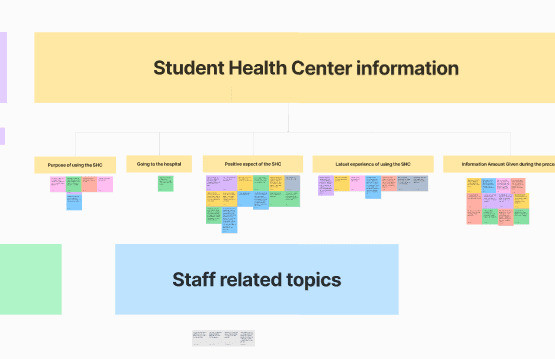
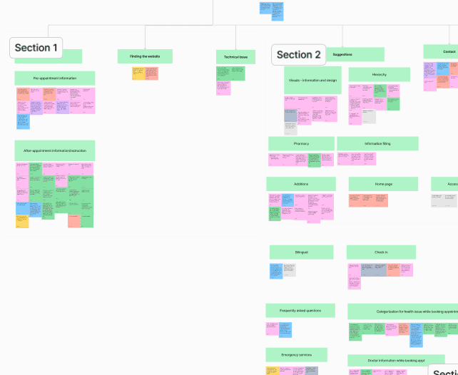
Our team had gathered feedback from students across different universities about their healthcare experiences. There was so much information - complaints about booking appointments, confusion about medical documents, struggles with finding the right services. We needed to turn all this into something useful.

I’m not familiar with the US health system.

The portal lacks a feature for me to communicate with her doctor.
I cannot find important information like doctor and department information while booking an appointments

I had a hard time understanding the homepage as it falsely indicates missing documents.

I need to fill out personal information and medical history every time I go there
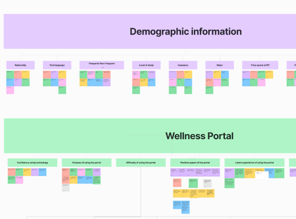
Mapping the chaos
I started by organizing all our data using an affinity map. I split everything into neat categories - student information, health center details, portal features.
"If I can just organize it well enough.
Navigating the fog of uncertainty
As I dug deeper, I uncovered a landscape filled with uncertainty
specific requirements were lackin
Design direction was unclear
Unsure which screen to prioritize
How I get there ?
The key is breaking big problems into smaller, manageable pieces. Here's how I did it
1. Prioritize key needs

Emergency
Appointment


Medicine
Doctor Information
Upcoming Visits
Visit Summary
Medical Record
2. Understanding the bigger picture
"What are we trying to solve?”
We needed to dive deeper into how students actually move through their healthcare journey.
After careful consideration, I refined my approach I identified four key behavioral stages in the student healthcare journey
The 4 key stages


3. Create User Stories
The behavioral stages were helpful, but still too abstract. I grabbed my whiteboard marker and thought, "How can we make this real for our team?"
I realized the key was to map out how students move through their healthcare journey, from feeling unwell to receiving care
With this goal in mind, I started creating detailed user story maps
4. Making the final design plan

Make most frequent tasks incredibly simple - we needed better organization system.
Home
Canlendar
Profile
My health
That's how I arrived at a mobile-first design direction with four main sections:
Home: Quick access to common needs
Calendar: All appointment-related features
My Health: Personal health records and history
Profile: Settings and preferences
Chapter 3.
Numbers Tell Stories: A Data-Driven Design Journey
Have you ever wondered why booking a doctor's appointment feels more complicated than ordering a pizza? That's the challenge I faced when designing a healthcare booking system that needed to be both comprehensive and simple.
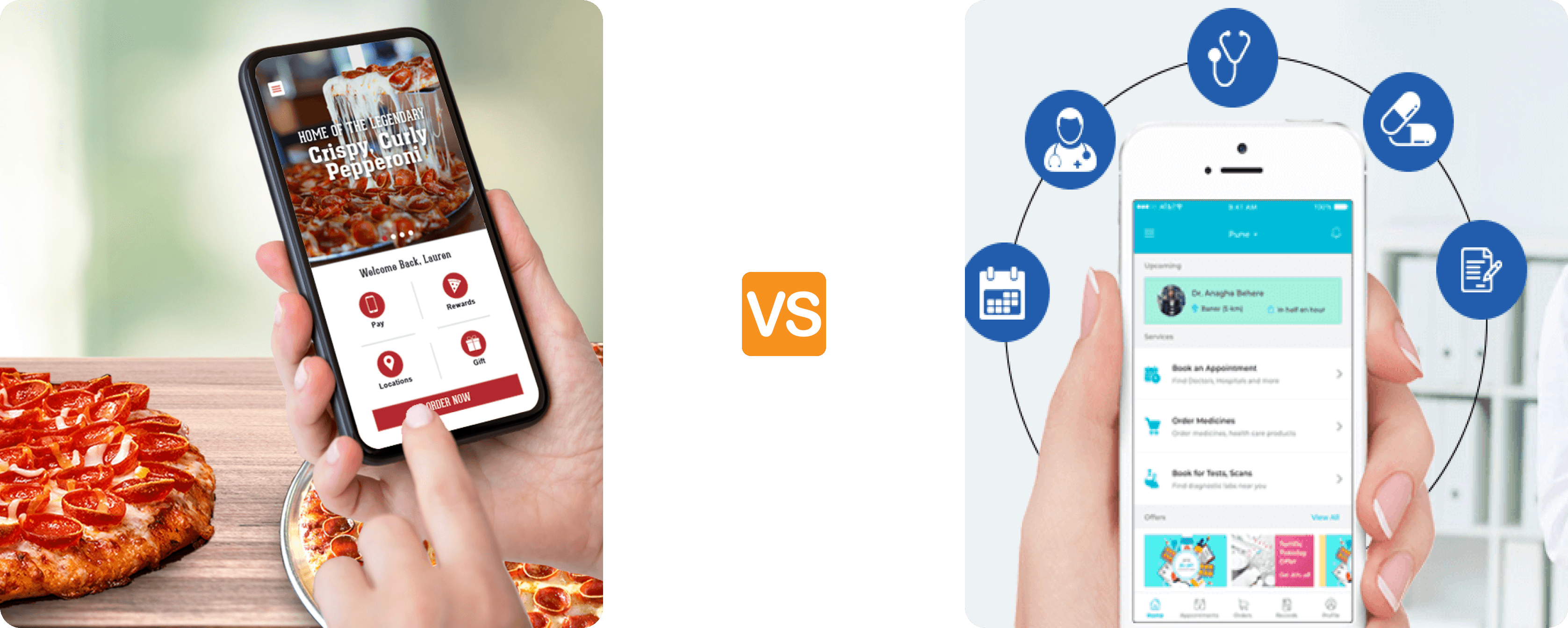
Choose pizza
Add to cart
Order!
Find reasons for appointment
Check insurance
Fill medical history
Select time slot
Confirm booking
Delayed care
Design decision 1
Hi, how can I help you today
What symptoms are you
experiencing
I have a headache and fever
I’ll help you find a doctor, how long
have you had these symptoms
Type your message...
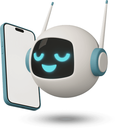
AI Chatbot Guide
Quick action
Book now
Upcoming
Dr. Smith - Tmr 2pm
Health metrics
Healthcare dashboard
Search symptoms...
Headache
Allergics
Stomach issues
Mental health
Navigation

Design decision 2
So here's what I discovered while working on the appointment booking flow - it was really interesting actually. We had two completely different ways students could book their appointments:
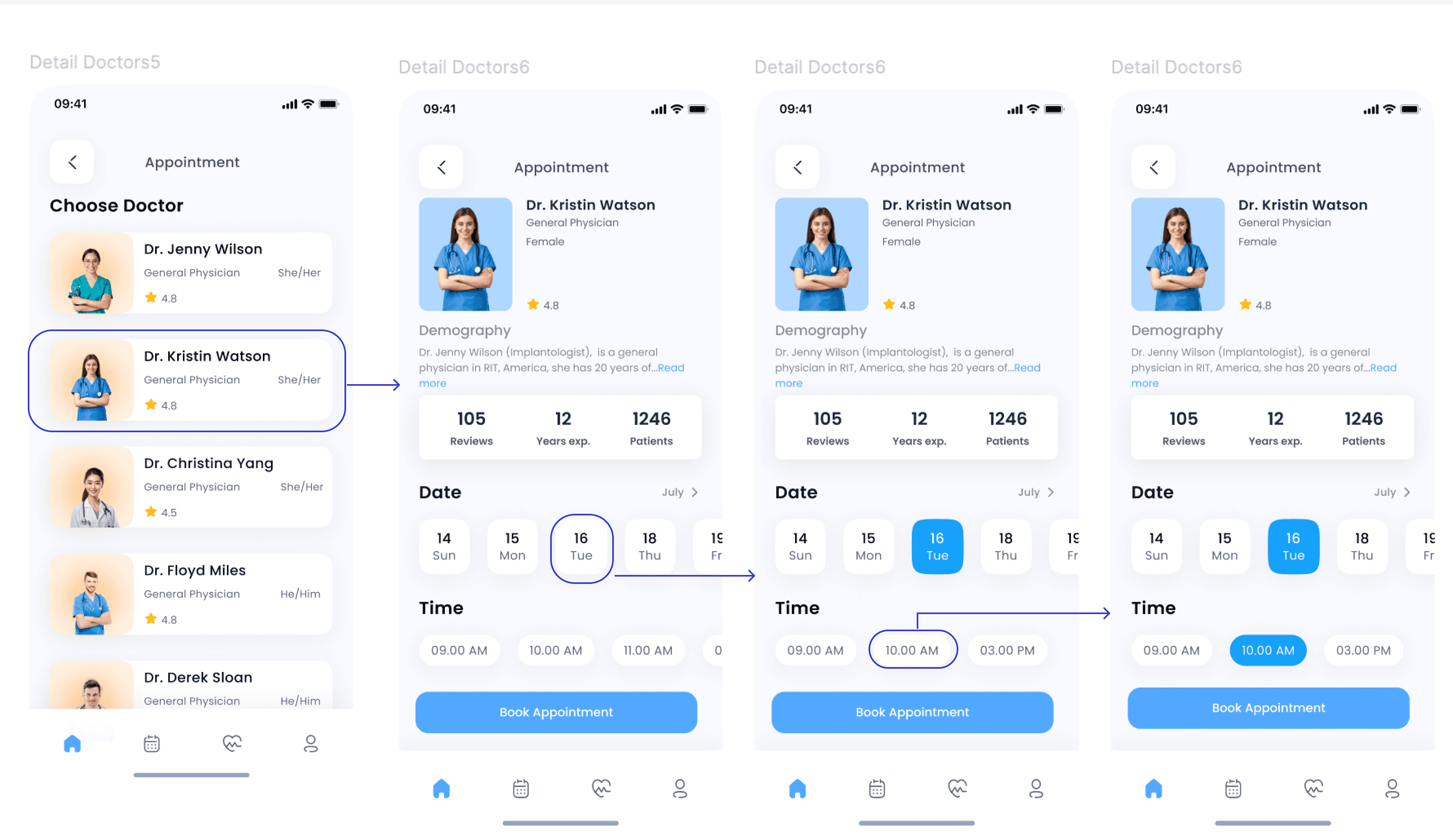
Flow 1: Doctor-First Approach
You pick your doctor first, check out their experience, read reviews, and then try to find a time that works.
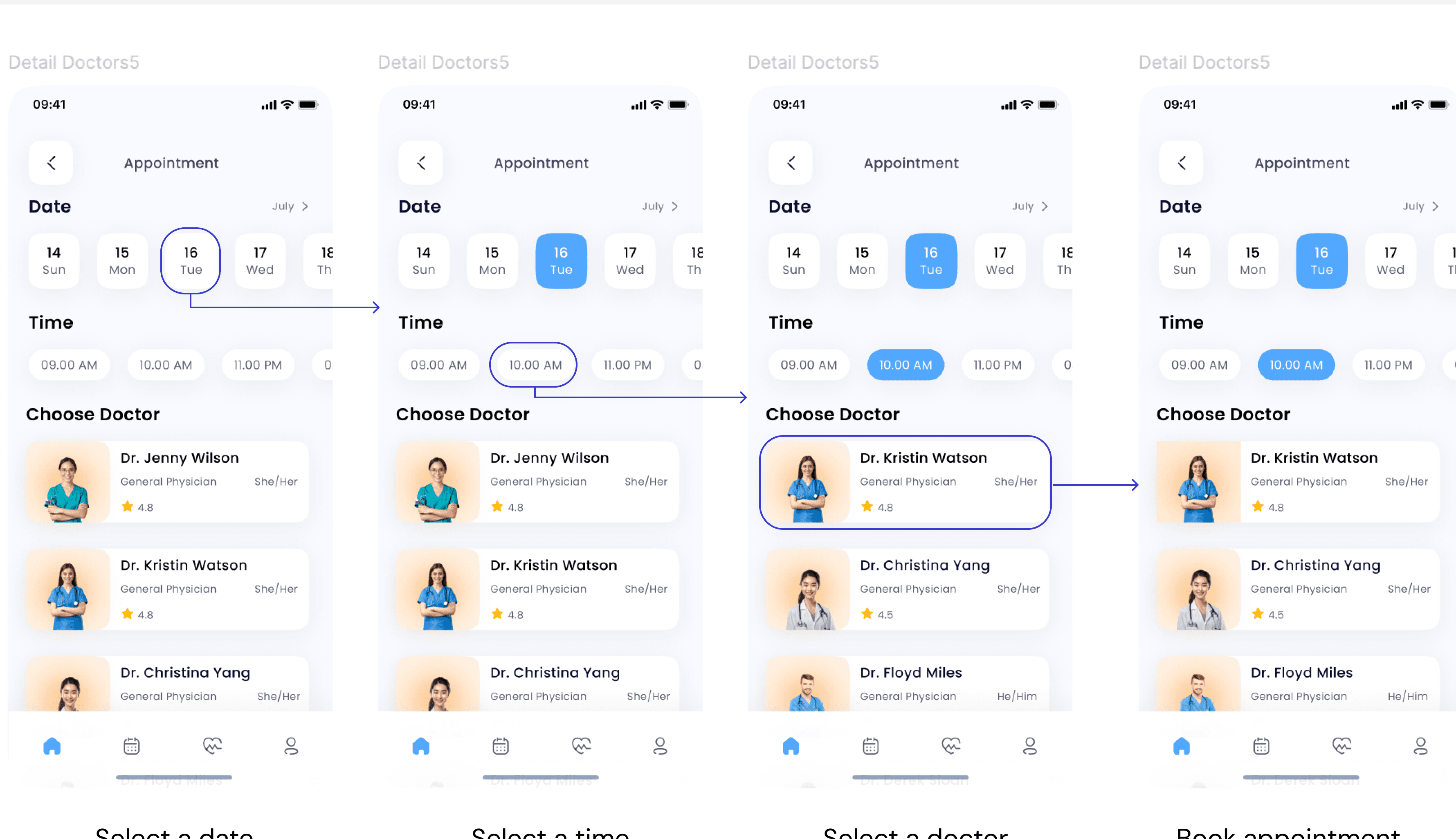
Flow 2: Time-First Approach
Which flipped the whole thing around - first pick when you want to be seen, then choose from doctors available at that time.

After conducting user research with students, the time-first approach emerged as the clear winner:
Final book appointment prototype
Book appointments
The user begins by logging into Uniwell, selecting their school, and entering their school email and password. Once logged in, they identify the reason for their appointment by selecting symptoms. Next, they choose a suitable day, time, and doctor to finalize their booking.
Other prototypes